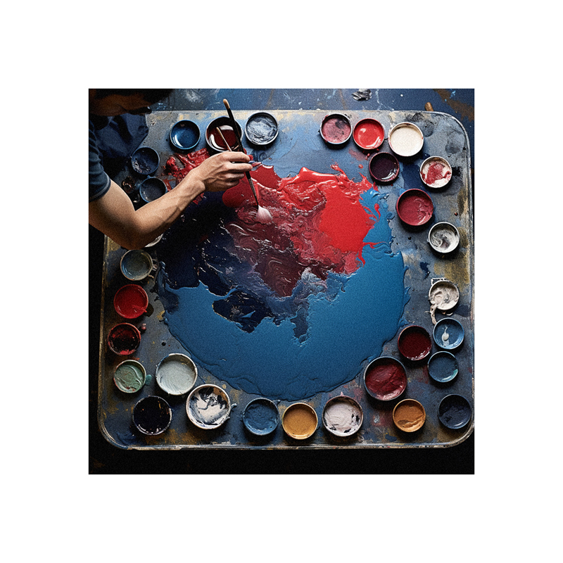
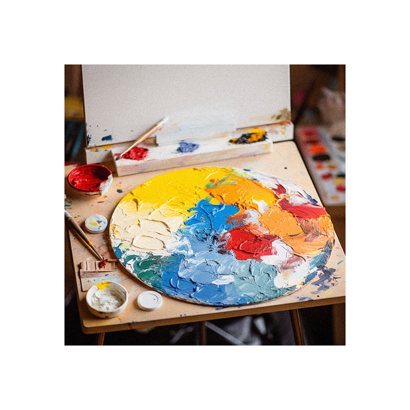
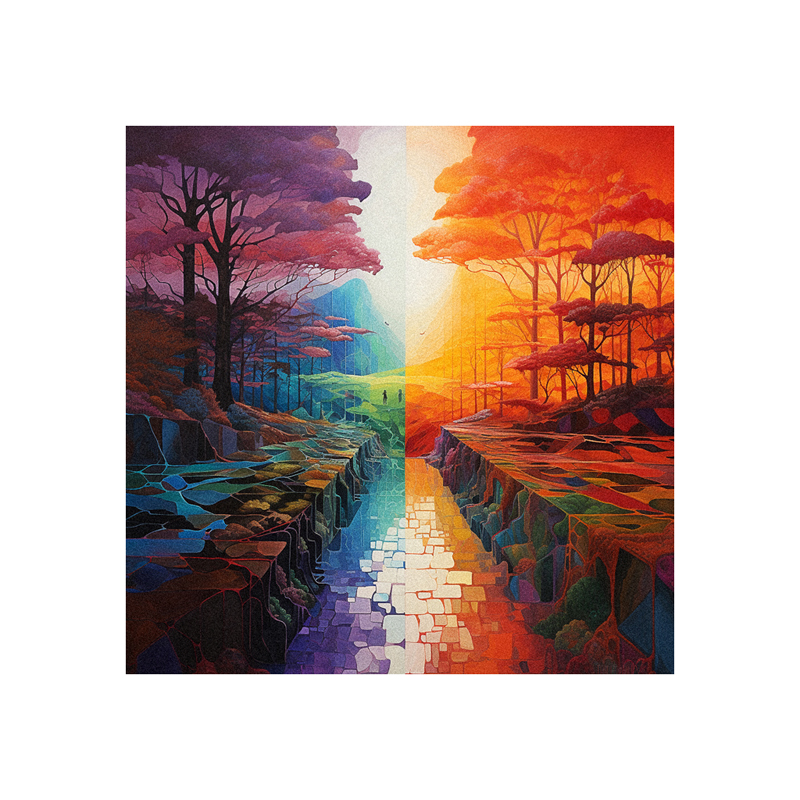
Mixing colors is an essential yet challenging skill for any painter. Mastering color theory and techniques allows you to create nuanced, vibrant paintings. This step-by-step guide will teach you the fundamentals of mixing colors. You’ll learn how to use primary colors and complements to mix any color. We’ll cover key concepts like value, temperature, and harmony. Follow these steps to gain confidence mixing captivating, dynamic colors.
- Step 1 – Understand Color Theory Basics
- Step 2 – Choose a Limited Palette
- Step 3 – Understand Your Pigments
- Step 4 – Map Your Composition's Values
- tep 5 – Mix Your Darks First
- Step 6 – Add White to Mix Lighter Tones
- Step 7 – Use Complements for Natural Colors
- Step 8 – Check Temperature
- Step 9 – Fine Tune Value Contrast
- Step 10 – Refine and Glaze Layers
- Frequently Asked Questions
Step 1 – Understand Color Theory Basics
The first step is grasping color theory foundations. While advanced color knowledge comes with time, these basics deliver immense value:
Primary colors - Red, yellow and blue. Combine primaries to create all other colors.
Secondary colors - Green, orange, and purple. Mix two primaries to get secondaries.
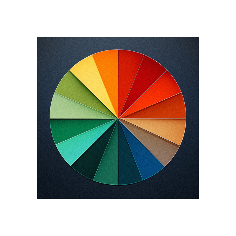
Color wheel - Displays relationships between colors. Opposite colors are complements.
Value - Lightness/darkness of a color. Adds contrast.
Temperature - Warmth or coolness of a color.
Harmony - Pleasing color combinations.Invest time upfront studying color theory. Learning these core concepts equips you with the framework to mix any color.
Step 2 – Choose a Limited Palette
It’s tempting to stock every paint color. However, limiting your selection to a few versatile essentials simplifies mixing. Start with:
Titanium white - Lightens and tints
Lemon yellow - Vibrant, transparent yellow
Cadmium red - Vivid, opaque red
Ultramarine blue - Rich, dark blue
Add colors like burnt sienna, yellow ochre, and cerulean as needed later. Master mixing with a primary palette first.
Step 3 – Understand Your Pigments
Not all paints are created equal. Know your pigment properties:
Transparency - Thin layers reveal underlayers. Great for glazes.
Opaqueness - Covers underlying layers. Better for blocking in color.
Staining - Sinks into canvas, hard to cover up.
Sedimentary - Heavier pigments settle when mixed. Remix occasionally.
Test your paints on a canvas to learn their mixing behavior. This informs smarter color choices.
Step 4 – Map Your Composition’s Values
Before mixing colors, simplify your reference image into basic value shapes. Squint your eyes to visualize lights, darks, and mediums.
Block in these value areas with acrylic paint or charcoal. Nail your values first, then layer color after. Values determine the underlying structure.
tep 5 – Mix Your Darks First
Begin mixing with dark colors, adding white to lighten. It’s tougher to darken light colors. Start dark:
Mix ultramarine blue with alizarin crimson for deep rich darks.
Cool browns = ultramarine + burnt sienna
Warm black = alizarin + burnt sienna
Mix enough paint to complete all your darks. Remix as needed to match colors.
Step 6 – Add White to Mix Lighter Tones
Once your darks are complete, add white to mix lighter colors:
Start with a dab of dark color, then add white to lighten
Add white in increments, mixing thoroughly after each addition
Compare to value sketch - does the tone match?
Take time to mix exact hues. Rushing leads to muddy colors.
Step 7 – Use Complements for Natural Colors
No color exists in isolation. Counterbalance with complements:
Mix opposites from the color wheel
This neutralizes colors, creating natural, earthy hues
Green + red = muted green for landscapes
Orange + blue = natural skin tone
Using complements harmonizes colors and mimics nature.
Step 8 – Check Temperature
Analyze your color’s temperature:
Warm - Yellows, reds, oranges
Cool - Blues, greens, purples
Is the temperature correct? Add a dash of the opposite temperature if needed.
This helps colors appear more natural and realistic. Don’t forget to tweak temperature.
Step 9 – Fine Tune Value Contrast
With all colors mixed, reassess value contrast:
Squint again at your reference and painting
Have you maintained proper value separation?
If areas blend together, add more light layers or dark accents
Don’t get lost in colors and neglect necessary value contrast. Give colors distinction.
Step 10 – Refine and Glaze Layers
Now refine color and add transparency:
Glaze over dry layers using thin paint to tint color
Build vibrant, luminous depth through multiple glazes
Soften edges and blend colors together
Intensify color with transparent glazed layers
Take time perfecting colors with glazing layers. This creates luminosity that brings paintings to life.
Common Color Mixing Mistakes to Avoid
Not mixing enough paint to complete an area
Neglecting value structure
Focusing on colors before values
Using cheap low-quality paint
Failing to understand color properties like transparency
Rushing the mixing process
Not building colors through layered glazing
Frequently Asked Questions
Should I buy student grade or professional paints?
Student grades have less pigment. Invest in professional paints with higher pigment levels. Good color mixing requires quality paint.
How do I avoid muddy colors?
Mix with a light touch – add small amounts of color and mix thoroughly. Take your time building transparent, luminous layers. Rushing leads to muddiness.
What if I can’t match a color?
Identify the color’s properties – temperature, transparency, etc. Use complements to neutralize. Add white for tints or black to darken. Observe how the color behaves in context. With practice, color matching becomes intuitive.