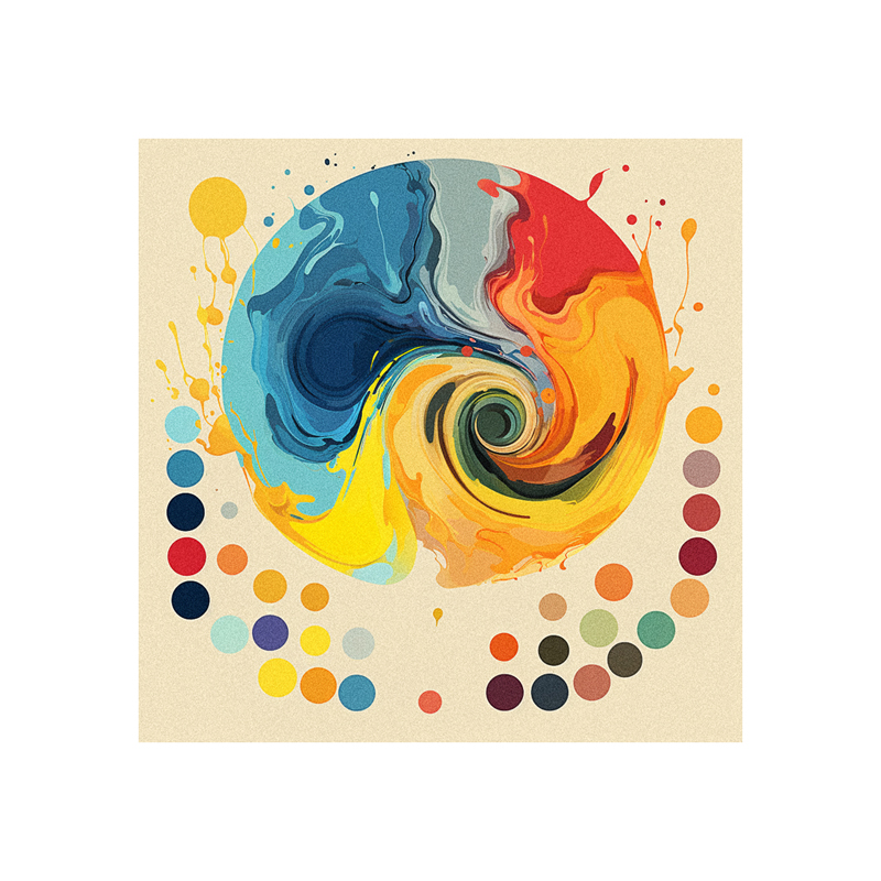
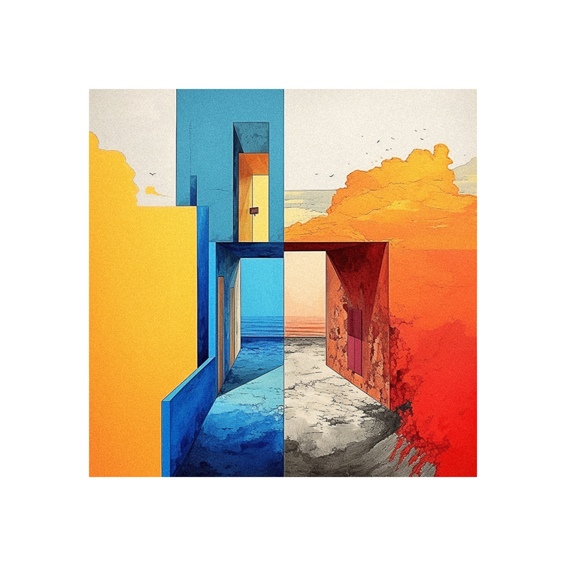
Tertiary colors are the subtle, nuanced hues created by mixing a primary color with a secondary color containing that primary. Filling in these transitional tones between the main color wheel hues provides a more sophisticated foundation for color theory and application.
This in-depth guide will explain the tertiary color mixing process, psychology, use cases, and relationship to other color schemes. Understanding tertiaries grants deeper mastery of color nuance for elevating fine art and design.
- How Exactly Are Tertiary Colors Made by Mixing?
- What Are the 6 Tertiary Colors on the Color Wheel?
- How Do Tertiary Colors Differ From Primaries and Secondaries?
- What Unique Color Psychology Do Tertiary Tones Evoke?
- In What Ways Are Tertiary Colors Uniquely Used in Painting and Design?
- What are the Key Differences Between Secondary and Tertiary Hues?
- How Do You Mix and Consistently Reproduce the 6 Tertiary Colors?
- How Do Split Complementary Color Schemes Relate to Tertiary Hues?
- Should Tertiary or Secondary Colors Be Used for Shading?
- Key Benefits of Mastering Tertiary Color Mixing and Harmony
How Exactly Are Tertiary Colors Made by Mixing?
Follow this simple process to mix any tertiary:
- Start by mixing two primary colors to form a secondary (e.g. red + yellow = orange).
- Then take that new secondary and add more of the primary color they share.
- For example, add more yellow to the orange. This produces the tertiary yellow-orange.
- The same logic applies to creating red-orange, yellow-green, blue-green, blue-violet, and red-violet tertiaries.
The color wheel makes this clearer – just mix a primary with an adjacent secondary containing that primary. The resulting tone sits right between them.
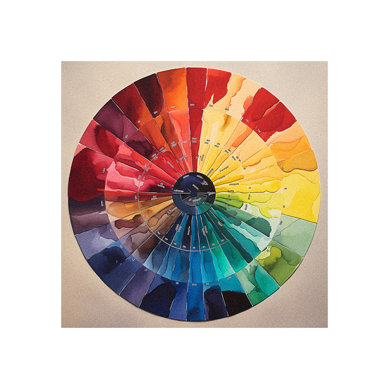
What Are the 6 Tertiary Colors on the Color Wheel?
There are six tertiary hues formed by strategically mixing together adjacent color pairs:
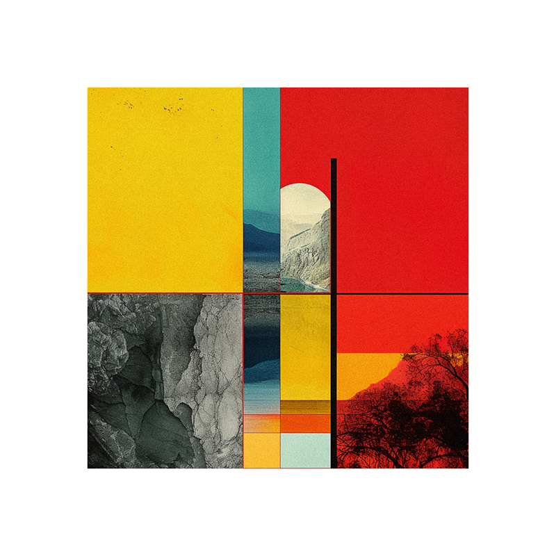
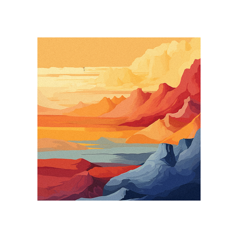
- Red-orange – Beloved for sunsets and autumn leaves
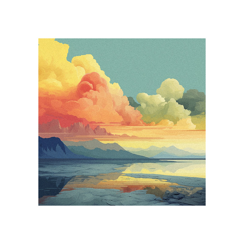
- Yellow-orange – Radiant and uplifting like a sunrise
- Yellow-green – Crisp and refreshing like new leaves
- Blue-green – Cool and serene like ocean shallows
- Blue-violet – Mysterious and mystical like deep water
- Red-violet – Vibrant and passionate like a perfectly ripe berry
Learning these hues and their emotional associations provides a rich color vocabulary.
How Do Tertiary Colors Differ From Primaries and Secondaries?
Primaries establish the basic structural framework, exerting the strongest visual impact.
Secondaries are highly vibrant as they contain two primary hues blended together. This makes them naturally eye-catching.
Tertiaries possess lower vibrancy since they mix a primary and secondary. This results in softer, more muted tones that create steady color transitions.
Tertiaries serve as the connective tissue between the bold structural primaries and vivid attention-grabbing secondaries. They produce subtler gradations.
What Unique Color Psychology Do Tertiary Tones Evoke?

The psychology of tertiary colors combines traits of both parent hues. For example:
- Cheerful yellow-orange evokes yellow’s optimism and orange‘s playfulness
- Mystical blue-violet blends blue’s spirituality and purple’s antiquity
Most tertiaries impart pleasant, gentle feelings thanks to their lower vibrancy. They excel at cultivating relaxation and comfort.
Their harmony also increases approachability. Vibrant secondaries can feel jarring in excess.
In What Ways Are Tertiary Colors Uniquely Used in Painting and Design?
Tertiaries shine when the goal is smooth transitions, delicate intricacy, and promoting relaxation. Key use cases include:
- Painting – Subtle shading, gradations, fog, delicate plant life
- Textiles – Unobtrusive accent hues, soothing patterns
- Interior Design – Non-abrasive wall and accent colors
- Branding – Soft vintage palettes, inviting feminine designs
Tertiary tones soften and livens up designs dominated by intense primaries and secondaries. They reduce harsh contrast for increased harmony.
What are the Key Differences Between Secondary and Tertiary Hues?
Secondary colors exhibit the highest level of vibrancy since they contain a mix of two primary hues. This makes them pop visually.
Tertiary colors possess lower vibrancy as they blend a primary and secondary. This forms softened, nuanced transitional tones.
In practice:
- Secondaries = Distinct, bright, lively, high impact
- Tertiaries = Understated, muted, gradual, low contrast
Seek balance. Too many saturated secondaries feels abrasive. But overusing muted tertiaries can cause muddiness.
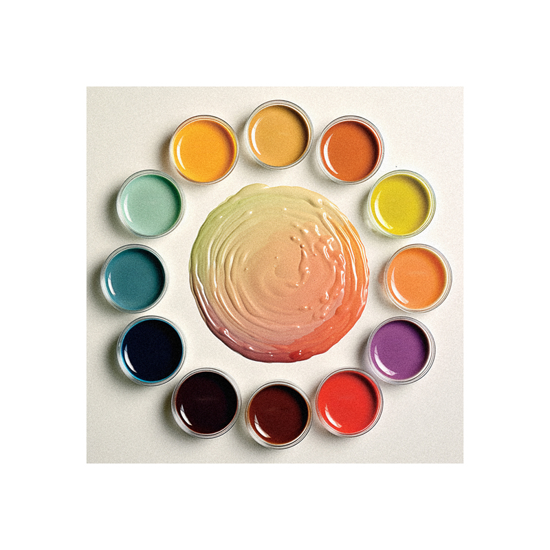
How Do You Mix and Consistently Reproduce the 6 Tertiary Colors?
Follow these formulas for reliably mixing that luscious tertiary palette:
Red-Orange – Start with orange, then add more red
Yellow-Orange – Start with orange, then add more yellow
Yellow-Green – Start with green, then add more yellow
Blue-Green – Start with green, then add more blue
Blue-Violet – Start with violet, then add more blue
Red-Violet – Start with violet, then add more red
The key is precisely controlling ratios. Always add equivalent amounts of the shared primary color to the secondary to maintain consistency.
How Do Split Complementary Color Schemes Relate to Tertiary Hues?
Split complementary schemes utilize a color plus the two adjacent tertiary colors on the wheel, forming a pleasing asymmetrical triad. The tertiaries create nuance and intrigue within this already bold framework.
For example:
- Orange split complementary = Orange + Yellow-Green + Blue-Green
- Magenta split complementary = Magenta + Red-Violet + Blue-Violet
This demonstrates how tertiaries produce color sophistication when strategically combined.
Should Tertiary or Secondary Colors Be Used for Shading?
It depends on the desired effect:
- Secondary colors intensify shadows through vibrant pop
- Tertiary colors subtly transition tones for gradual, nuanced shading
Often the best approach is balancing intense secondaries with tertiary transitions to make colors pop while still achieving depth.
Key Benefits of Mastering Tertiary Color Mixing and Harmony
- Allows creation of a wider range of precise hues from basic primaries
- Bridges gaps between main color wheel hues for seamless color flow
- Essential for visually pleasing shading, gradients and color transitions
- Reduces harsh contrast and vibrancy for increased relaxation
- Unlocks greater opportunities for color nuance and sophistication
- Strengthens foundations for applying color theory knowledge
Dedicate time to fully understanding the tertiary palette. This unlocks abundant color finesse to considerably elevate paintings, designs, and artistic eye.