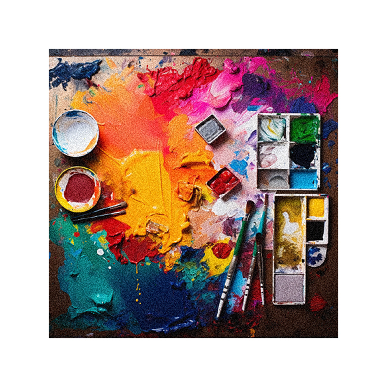
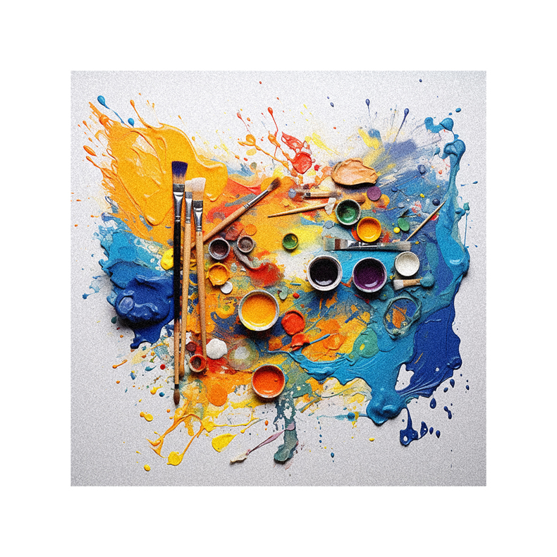
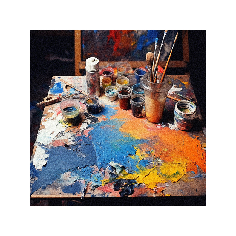
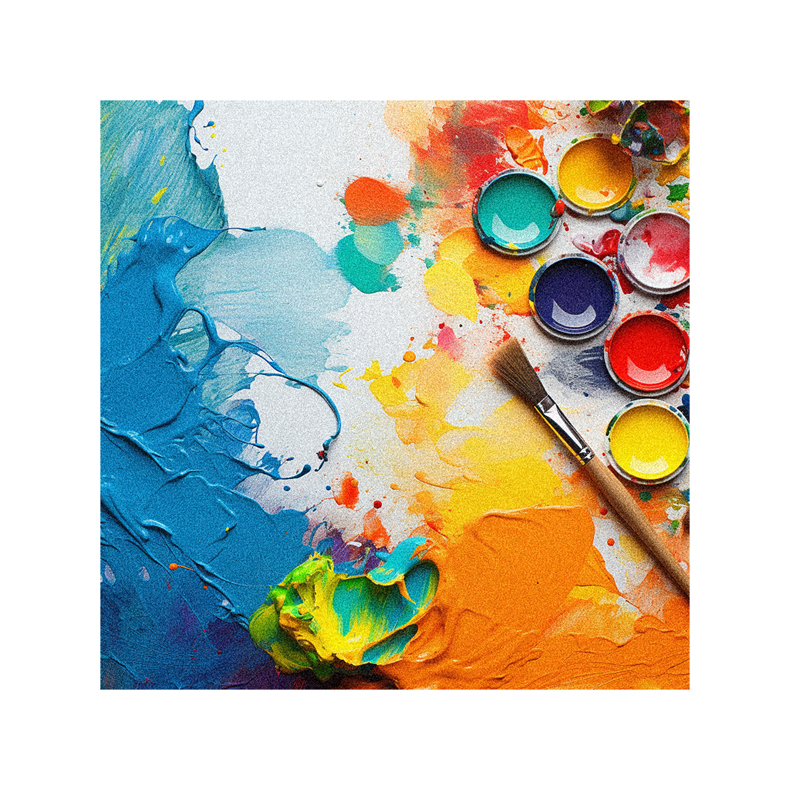
Color theory examines the science and psychology of how colors interact to shape human emotions and behaviors. Mastering foundational principles allows graphic designers to make informed choices that elicit desired reactions. This guide covers core color theory concepts to elevate visual communication skills.
- What Are the Primary Colors and How Do They Mix?
- How Does Color Harmony Impact Overall Aesthetics?
- How Do Colors Elicit Different Psychological and Emotional Reactions?
- How Does Cultural Context Impact Color Symbolism and Meaning?
- How Do Demographic Factors Like Age and Gender Influence Reactions to Color?
- How Can Designers Use Color Contrast and Harmony to Direct Visual Focus?
- What are the Most Legible Color Combinations for Strong Readability?
- How Should Designers Test Color Combinations to Identify Optimal Solutions?
- Key Takeaways on Maximizing Visual Communication Through Color Theory
What Are the Primary Colors and How Do They Mix?
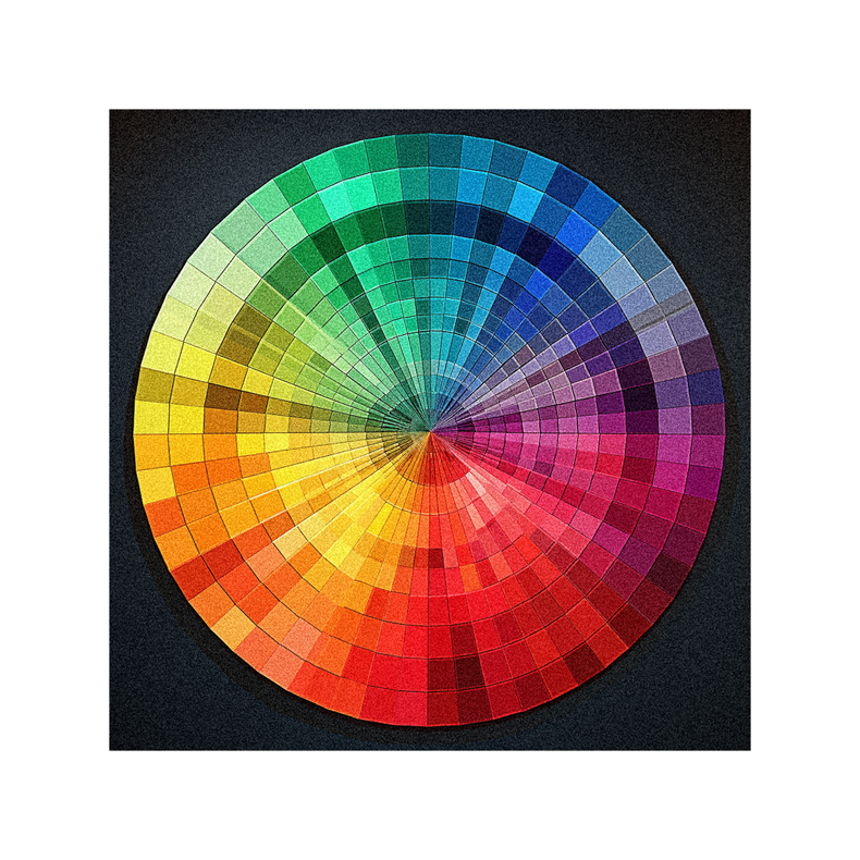
The primary colors of pigment are red, blue, and yellow. These hues can’t be created through mixing – all other shades stem from combinations of primaries.
Secondary colors form by blending two primary pairs – red and blue make purple, blue and yellow create green, red and yellow yield orange. Further mixing primaries results in shades like blue-violet and red-orange called tertiary colors.
Understanding primary color relationships provides a foundation for intentional pigment blending. With mastery, designers gain the ability to mix any desired hue through primaries.
How Does Color Harmony Impact Overall Aesthetics?
Color harmony refers to the visually pleasing coherence of coordinated color combinations. Certain complementary or contrasting color schemes inherently work together to create psychologically balanced, stimulating visuals.
Analogous harmonies utilize adjacent colors on the color wheel like blue, blue-violet, and violet. Complementary schemes skillfully combine opposing colors such as red and green or orange and blue.
Triadic systems expertly use three equidistant colors like yellow, purple, and green. Study color harmony principles to learn ideal harmonious mixes for different design objectives.
How Do Colors Elicit Different Psychological and Emotional Reactions?
While some personal associations inevitably exist, certain colors inherently carry fairly consistent psychological effects on human emotions and behaviors.
Warm hues like reds, oranges, and yellows feel energizing, playful, and passionate. Cool shades of blue, green, and purple evoke feelings of tranquility, trust, and professionalism.
Neutral palette additions like white, gray, and black project formal elegance and luxury. Always research your target users’ psychological associations with colors to ensure selections align with brand personality and intended reactions.
How Does Cultural Context Impact Color Symbolism and Meaning?

While some color meanings seem innate, it’s important to note additional layers of symbolism stem from cultural influence and should be considered. Red, for example, projects excitement in the U.S. but anger in Japan. White represents purity in Western cultures but mourning in India.
Avoid relying on broad generalizations about color meaning that don’t account for cultural context. Thoroughly vet color choices when adapting branding and designs for international audiences.
How Do Demographic Factors Like Age and Gender Influence Reactions to Color?
In addition to cultural associations, demographics like gender and age cause variation in responses to color. For example, studies show women generally demonstrate preferences toward softer pastel hues while men gravitate toward bold stimulating primaries.
Younger generations may be drawn to neon brights while more subdued traditional schemes appeal to older groups. Always keep your target audience’s gender, age range, and other factors in mind when designing, aiming to appeal to the majority, not outliers.
How Can Designers Use Color Contrast and Harmony to Direct Visual Focus?
Color theory reveals tactics for guiding the viewer’s eye using strategic contrast and harmony. Since contrast attracts attention, brighter colors draw focus against muted backgrounds. Warm shades seem to come forward while cool blues and greens recede into the distance.
Saturated color accents focalize key elements like call-to-action buttons. Red commands attention and implies warning. Thoughtfully composed color flow can elegantly direct the viewer’s gaze across imagery and interface elements.
What are the Most Legible Color Combinations for Strong Readability?
Along with aesthetics, graphic designers must ensure legibility by choosing color combinations allowing quick, seamless content consumption.
For strong readability, opt for high contrast between body text and background colors. Avoid red and green or blue and purple pairings for copy. Analyze headline and body text shades as well for sufficient contrast.
Maximum contrast can be achieved through combinations like black text on a crisp white or yellow background. Always thoroughly test legibility across different mediums and devices.
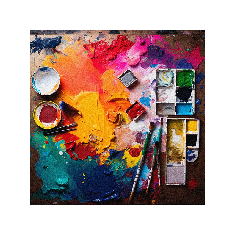
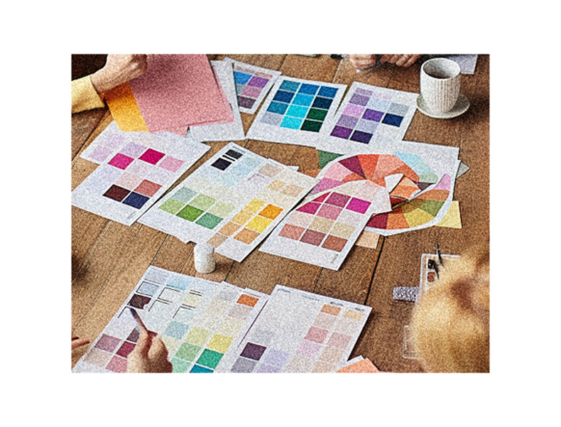
How Should Designers Test Color Combinations to Identify Optimal Solutions?
Applying color theory in design requires extensive testing and iteration. Digital prototyping allows rapid visualization and user testing of multiple proposed schemes.
Present color palettes and compositional designs to test groups from your target demographic for feedback. Gauge reactions and measure metrics like completion rates to empirically identify optimal solutions.
Continuously refine combinations over time as color trends and psychological research evolve. Avoid ineffective choices through ongoing experimentation and user validation.
Key Takeaways on Maximizing Visual Communication Through Color Theory
- Foundational primary color mixing principles enable the intentional creation of any desired hue
- Harmonious color schemes project cohesive aesthetics aligned to branding goals
- Color associations help designs elicit desired psychological reactions
- Cultural contexts and user demographics influence color symbolism and reactions
- Contrast and harmony strategically direct visual focus
- Test color combinations with user groups to identify ideal solutions
By mastering these core color theory concepts, graphic designers gain the skills necessary to boost visual communication through informed, intentional color choices.